What do COD, PRD and PRB mean in a ratio study?
Douglas Kuss, Certified Residential Appraiser
The median ratio states the assessment level, COD states how uniform the ratios are around it, and PRD and PRB state whether high-value and low-value properties are assessed at the same level — the two faces of equity. Together the four scored statistics answer the two questions a ratio study exists to ask: is the level right, and is it the same level for everyone?
What a ratio study tests
A ratio study divides each sold property's assessed value by its sale price and studies the distribution of those ratios. It measures a group — a class, a neighborhood, a roll — never one property: a single parcel's ratio says almost nothing, and the study's statistics only mean something across the array. The denominator is sales, which is both the method's strength (sale prices are the market's own numbers) and its standing caveat (sold properties stand in for the unsold roll).
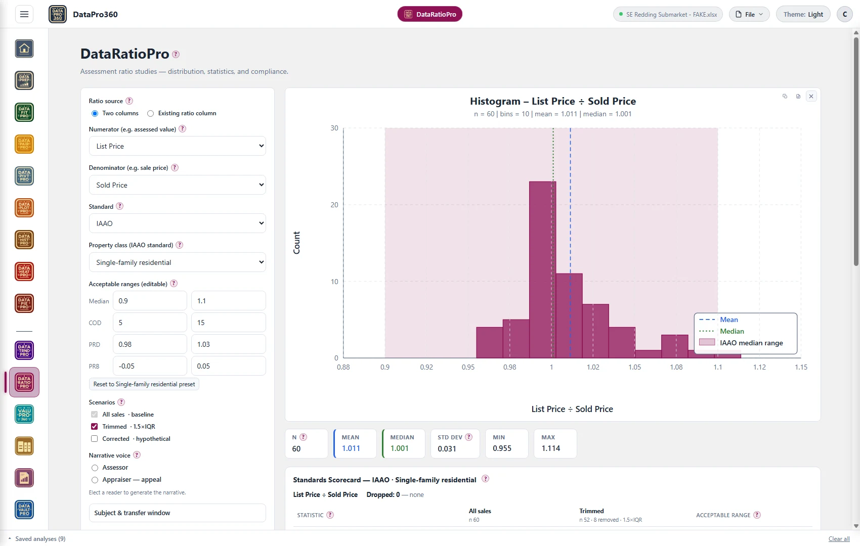
One note on the worked example running through this page: the engine is generic — it ratios any two columns — and the demonstration file is a sixty-sale market pull with no assessment roll attached, so the ratio shown on the frames is list price over sold price standing in for assessed value over sale price. The statistics, the bands and the scorecard behave identically; read "list price" as your numerator.
The median ratio
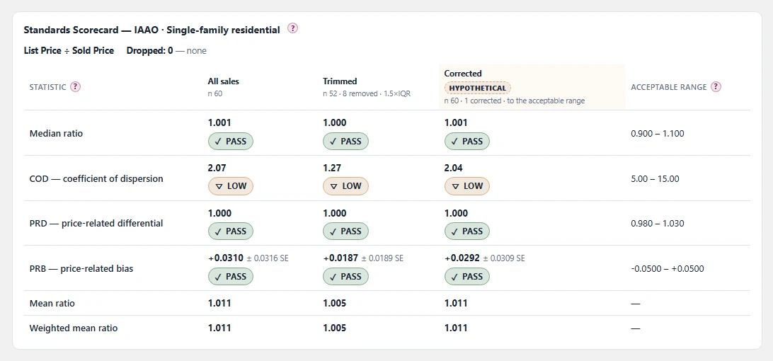
The middle ratio of the array, and the study's statement of assessment level. A median of 0.95 says the typical property is assessed at 95% of its market value; 1.05 says five percent over. The median is preferred to the mean for level because a handful of extreme ratios drag a mean and do not drag a median. The single-family band runs 0.90 to 1.10. On the sixty-sale example the all-sales median reads 1.001 — a level within a tenth of a percent of the market.
COD — coefficient of dispersion
The uniformity statistic — horizontal equity. COD is the average distance of the ratios from the median, expressed as a percentage of the median: a COD of 12 says the typical parcel's ratio sits about 12% from the median ratio. Two properties alike in value should carry alike assessments, and COD is the number that says whether they do. The single-family band runs 5 to 15. And the floor matters as much as the ceiling: a COD below its range reads LOW, which is its own status and not a failure — on this example the COD reads 2.07, dispersion tighter than the band's floor, which in a real assessment context is a flag to understand (sales chasing produces exactly this signature) rather than a defect in the arithmetic.
PRD — price-related differential
The first vertical-equity statistic. PRD is the mean ratio divided by the weighted mean ratio — weighted by price — so it asks whether expensive and inexpensive properties carry the same level. A PRD above 1.03 reads regressive: lower-value properties assessed at a higher level than higher-value ones. Below 0.98 reads progressive — the reverse. The band, 0.98 to 1.03, is deliberately asymmetric: the regressive side gets the wider tolerance because ordinary appraisal behavior leans that way. The example reads 1.000 — mean and weighted mean in agreement.
PRB — price-related bias
The second vertical-equity statistic, and the more modern one. PRB is a regression coefficient: the percentage change in ratio per doubling of value. A PRB of −0.03 says ratios fall about 3% each time value doubles — regressivity stated with a direction and a size, where PRD only points. It comes with a standard error, and the error is part of the reading: a coefficient smaller than its own standard error is a shrug, not a finding. The band runs −0.05 to +0.05; the example reads +0.0310 ± 0.0316 — inside the band, and smaller than its standard error.
The bands, and what "acceptable" means
The bands above are the IAAO single-family ranges. Median, PRD and PRB carry the same band for every property class; COD is the one that moves — 5–15 for single-family, tighter for newer homogeneous stock, wider for income property and wider again for vacant land, because unlike stock disperses honestly. Two things keep "acceptable" honest. First, the standard is an election, not a law of nature — the ranges are editable, electing no standard computes everything and scores nothing, and most California counties and the State Board of Equalization do not follow IAAO — so the study states which standard it was scored against. Second, the scorecard scores only the four: mean and weighted mean are reported with no range and no status, because no framework publishes one for them.
What the three scenarios let an office see
The scorecard above runs three columns. All sales is the baseline and always on — the study as the data stands, sixty sales in. Trimmed re-runs the study with outlier ratios removed by a stated fence — here 1.5×IQR, 8 removed, 52 kept — showing how much of the dispersion is a few extreme ratios; the fence knows nothing about why a ratio is extreme, so trimming supplements sale validation and never replaces it. Corrected is labeled HYPOTHETICAL on its face: it asks what the statistics would read if the flagged ratios were corrected to the nearest edge of the acceptable range — here one ratio corrected — a what-if for planning a reappraisal's effect, never a statement about the roll as it stands. Three columns, one page: what is, what is without the extremes, and what would be.
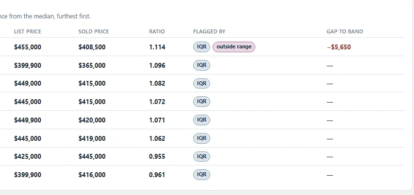
Behind the scenarios sits the work list. The flagged rows are sorted by distance from the median, furthest first — the same table is the tax-appeal exhibit and the reappraisal work list. On the example, eight rows flagged by the IQR fence, led by a ratio of 1.114 that also sits outside the acceptable range with a $5,650 gap to the band's edge.
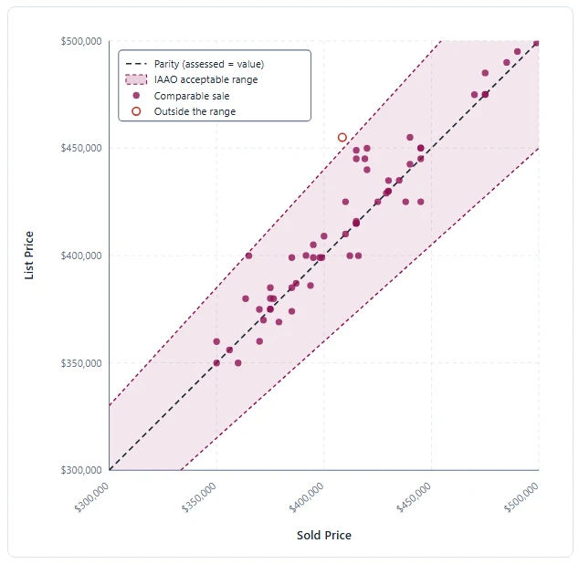
The equity scatter puts the same story on one chart: each sale plotted with its assessed value against its price, the parity line where assessed equals value, the acceptable range as a band around it — and any sale outside the band ringed, so the exhibit and the work list point at the same parcels.
What the two narrative voices are for
The same statistics serve two readers, and the study's narrative can be generated for either. The assessor voice writes for the office and the board: level, uniformity and equity as a management reading of the roll, with the scenarios as planning tools. The appraiser — appeal voice writes for a taxpayer's side of a hearing: the subject placed against the distribution, the flagged rows as exhibits. Electing a reader changes the prose, not the arithmetic — the numbers are the same either way, which is rather the point.
What belongs in the study
The ratio definition — what was divided by what; the sample and period; the standard elected, or the statement that none was; all four scored statistics with their bands and statuses, LOW included, plus the unscored means; the trim fence and how many rows it removed; the hypothetical scenario labeled as hypothetical wherever it appears; and the flagged rows. A study that states its own dispersion honestly — including a COD suspiciously below its floor — is credible in front of a board in a way a page of unqualified PASSes is not.
Doing this in DataPro360
DataRatioPro runs the study on any two columns of your own data, scores the four statistics against the standard you elect — with the ranges editable and no standard a first-class choice — and states LOW, the scenarios, the flagged rows and the equity scatter as shown above. The narrative generates in either voice, and the whole study exports to the report.