
DataPiePro
Proportions of a whole, by category — what share of the total each one holds.
Composition — share/pie breakdowns of categorical makeup.
What it does
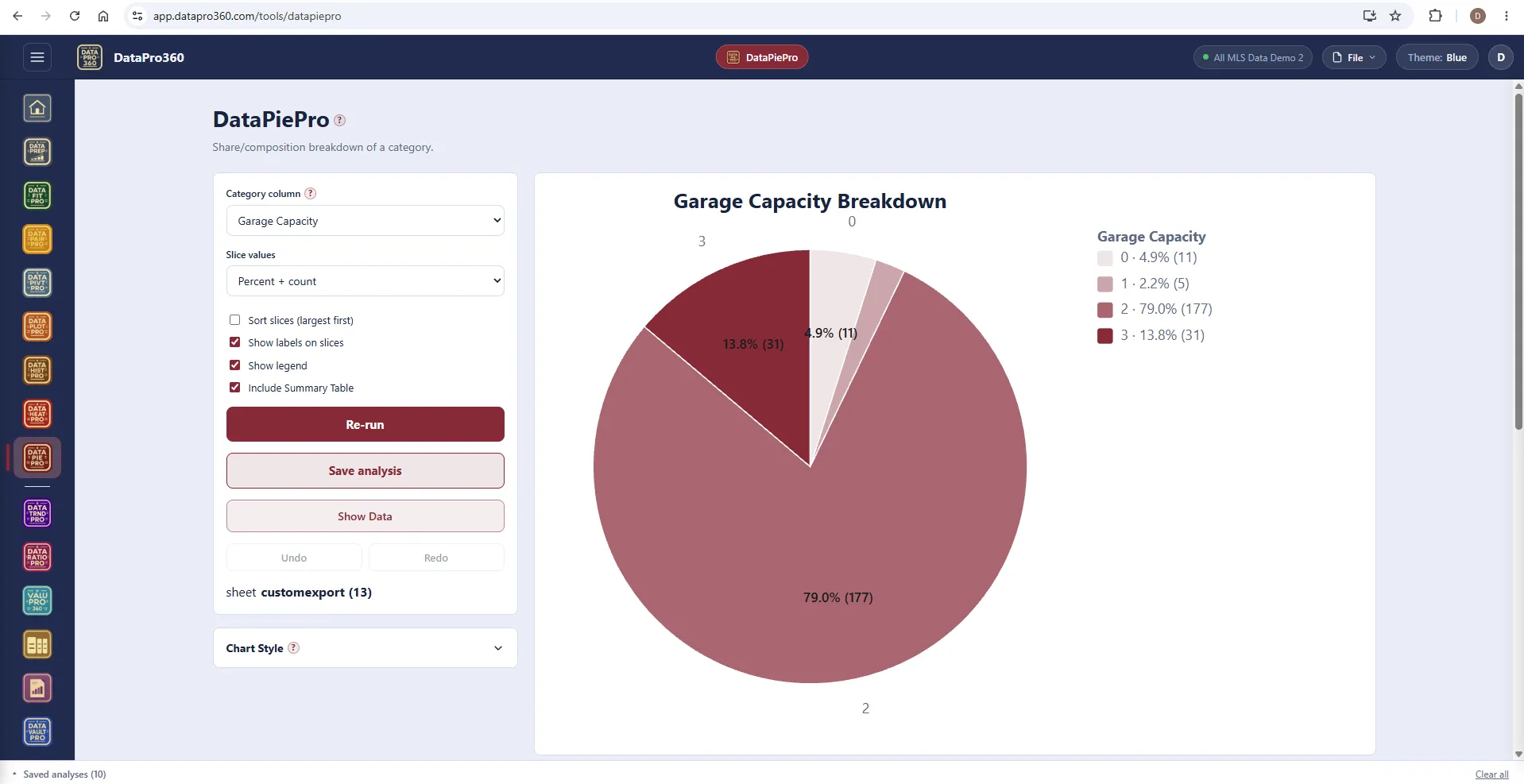
DataPiePro shows proportions of a whole, by category. Counts or sums by category, drawn as slices: it answers one question — what share of the total does each category hold — and it answers it fast. Garage capacity, property type, financing, status: the composition of the dataset in one chart, with the percent and count on every slice and a summary table beneath.
A pie is the right chart when there are a few categories and the question is share; it is the wrong chart when there are many, or when the question is comparison — a bar chart reads those better, and the tool says so. Sort slices largest first, label them, and keep the legend for the reader who wants the numbers.
Show Data holds the rows behind every slice; click one and the panel filters to that category, so a slice that surprises you is one click from its sales.
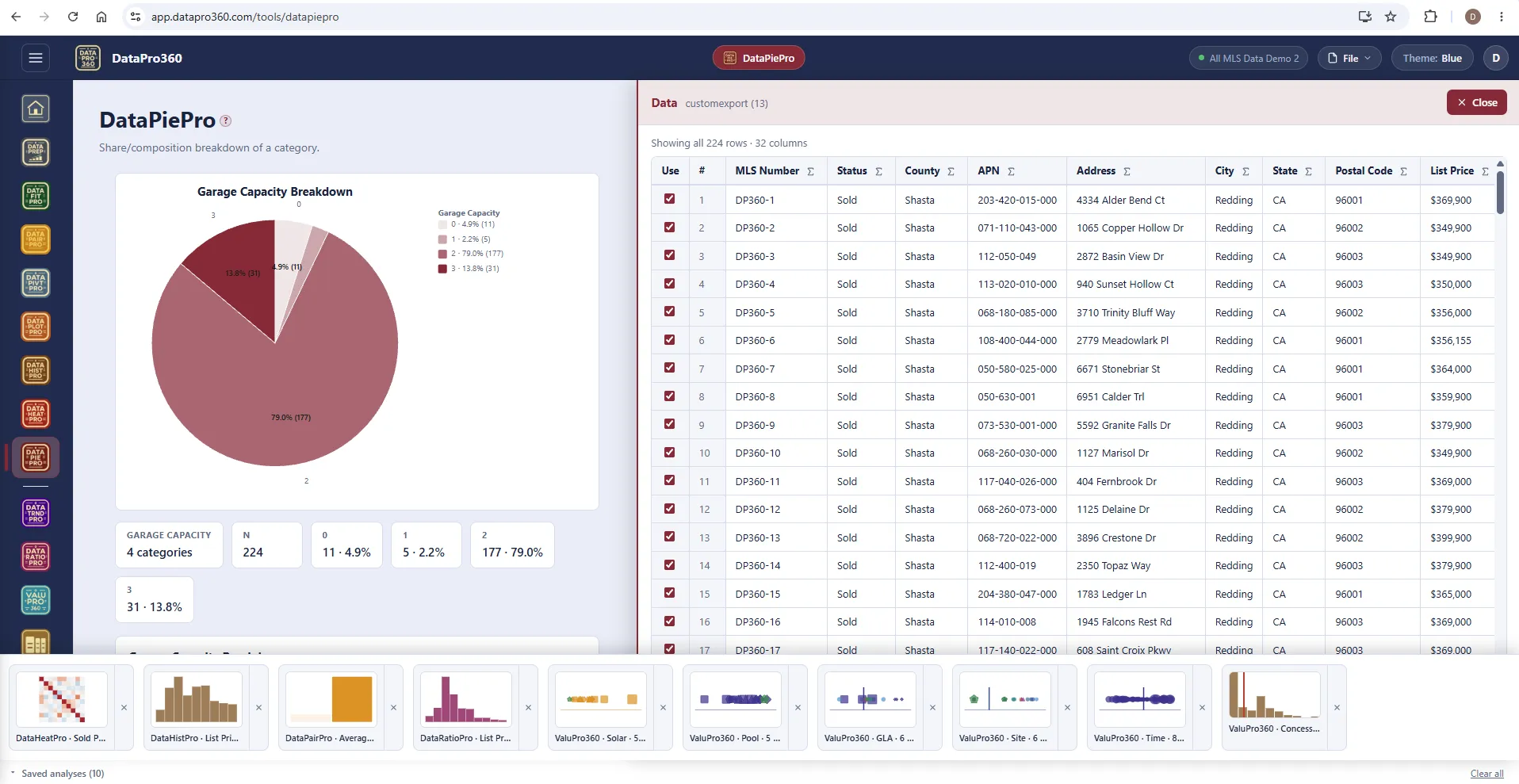
Show Data and the saved tray.
The rows behind the pie, the statistics strip with each category's count and share, and the tray of saved analyses — a heat map, a histogram, a pairing, a ratio study and the station results — along the bottom.
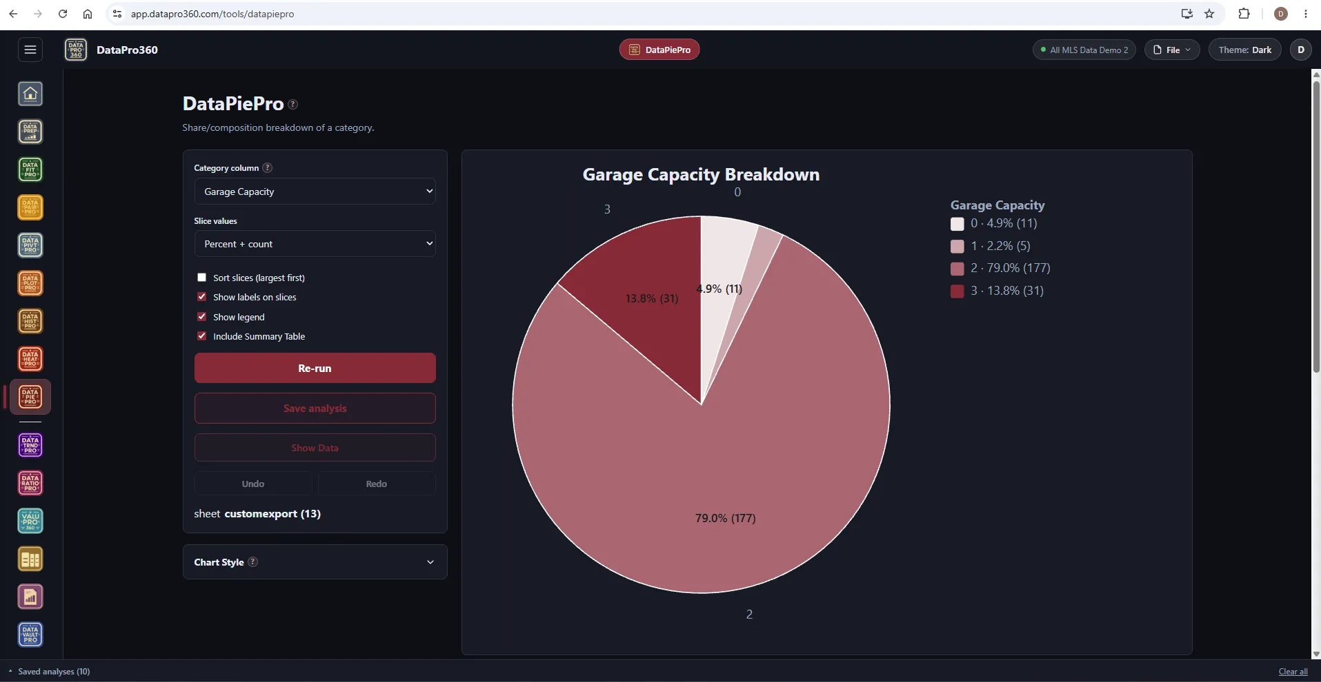
The same pie in the Dark theme.
Slices, labels and legend on the dark workspace.
Where it sits
In the workflow
DataPiePro reads the prepared dataset. A saved pie carries into Report Manager with its summary table and narrative.
See the whole workflow →Before
 DataPrep
After
 Report Manager
Prove the numbers in your next report.
Load your own MLS export and work a real assignment through the trial — every chart, every method, the finished report.
$69.95 per user, per month. 30-day free trial, no credit card required. No long-term contract.