
DataFitPro
Fit a line or curve through two variables and report the relationship — equation, fit statistic, and a narrative written from the fit.
Regressions and trends, linear and polynomial, with a narrative from the fit.
What it does
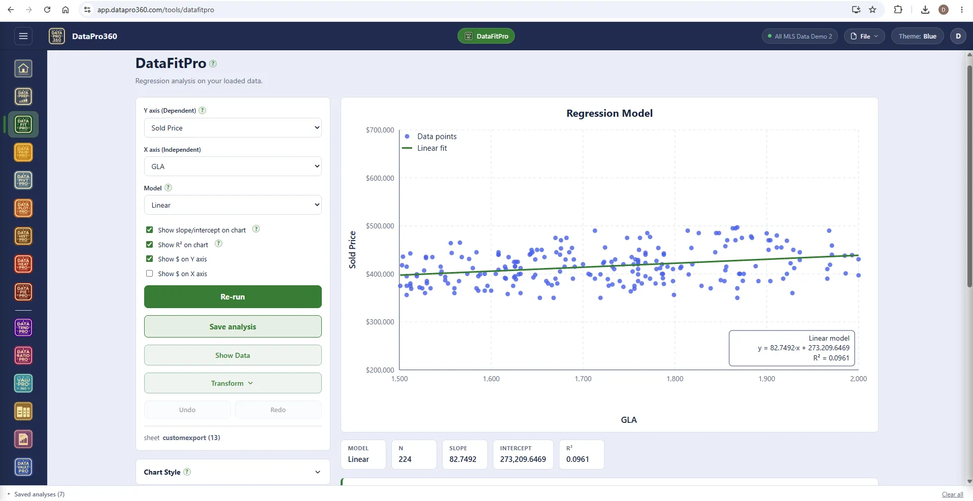
DataFitPro fits a line or curve through two numeric variables and reports the relationship between them. You pick an X column and a Y column; the tool plots the points and fits the model, reporting its equation and fit statistic. The question it answers is "how does Y move when X changes, and how reliably."
What you get: the scatter of points, the fitted line drawn over them, the equation, the fit statistic, a statistics strip — model, n, slope, intercept, R² — and a written narrative that describes the finding and the methodology. Linear and polynomial models; choose between them by what the data supports, not by which reads better.
It shares the common shape of every free-form tool: what to analyze, how to configure it, Run; the result; the statistics strip for what is currently included; the narrative; Show Data holding the rows behind the chart; Chart Style; Save analysis; Export. Learn one tool and the others are the same surface with a different chart.
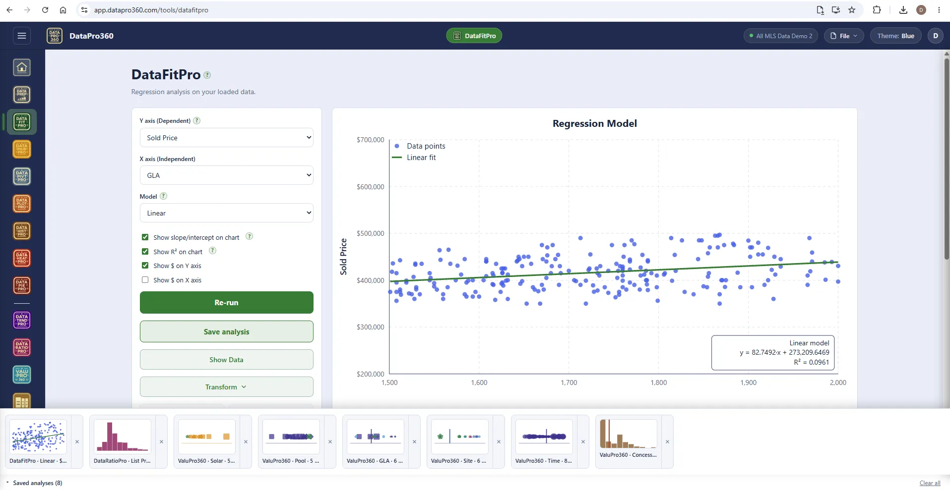
Save it, and it is in the tray.
Every saved analysis sits in the tray along the bottom, in the tool's own color, and carries into Report Manager as a section — chart, statistics and narrative together. Re-run and save again, and the report carries the current version.
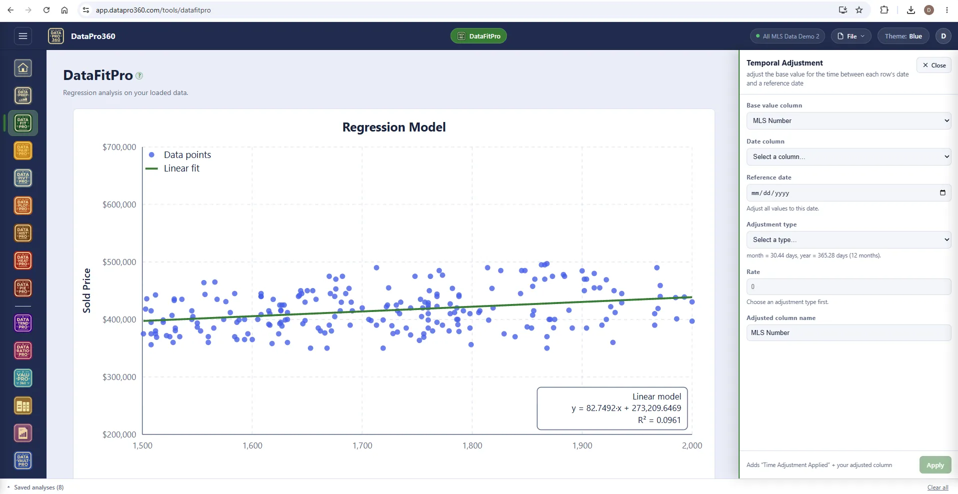
Transform, from inside the tool.
Apply a DataPrep transform without leaving the chart — here a Temporal Adjustment. It commits to the one shared transformation log, and the new column appears everywhere at once: axis dropdowns, Show Data, DataPrep.
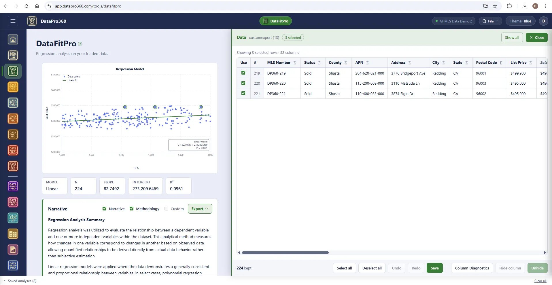
Show Data — click a mark, see the row.
Click a point — or Ctrl-pick several — and the panel filters to just those rows, so you find out what produced a shape you did not expect. Uncheck a row and everything recomputes immediately: chart, statistics, narrative. Exclusions are per surface; the row stays in the dataset for every other tool.
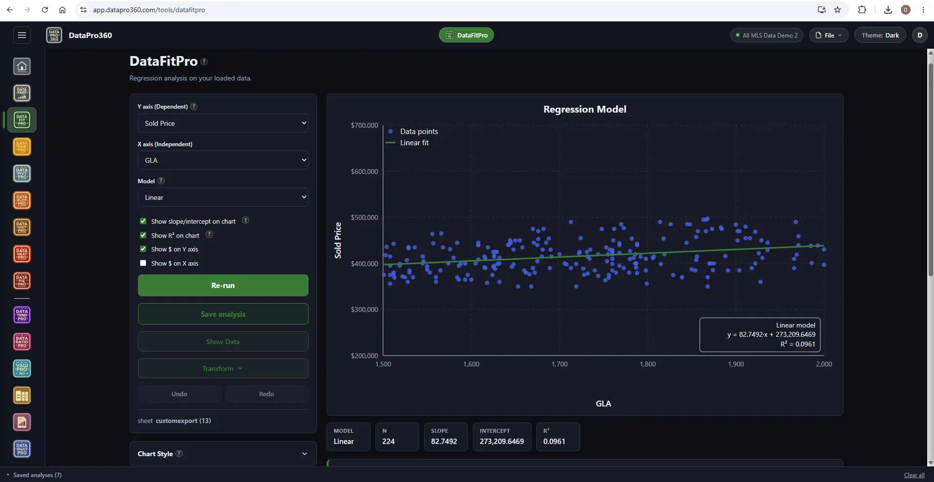
The same fit in the Dark theme.
Chart, strip and narrative read the same in Blue, Light or Dark.
Where it sits
In the workflow
DataFitPro reads the prepared dataset and can also be opened directly on the Comp Grid's selected comparables. A saved fit carries into Report Manager as a section.
See the whole workflow →Before
 DataPrep
After
 Comp Grid
 Report Manager
Prove the numbers in your next report.
Load your own MLS export and work a real assignment through the trial — every chart, every method, the finished report.
$69.95 per user, per month. 30-day free trial, no credit card required. No long-term contract.