
DataHeatPro
A correlation matrix of the variables you choose, colored by sign and strength.
Correlation heat maps of the variables you choose, by sign and strength.
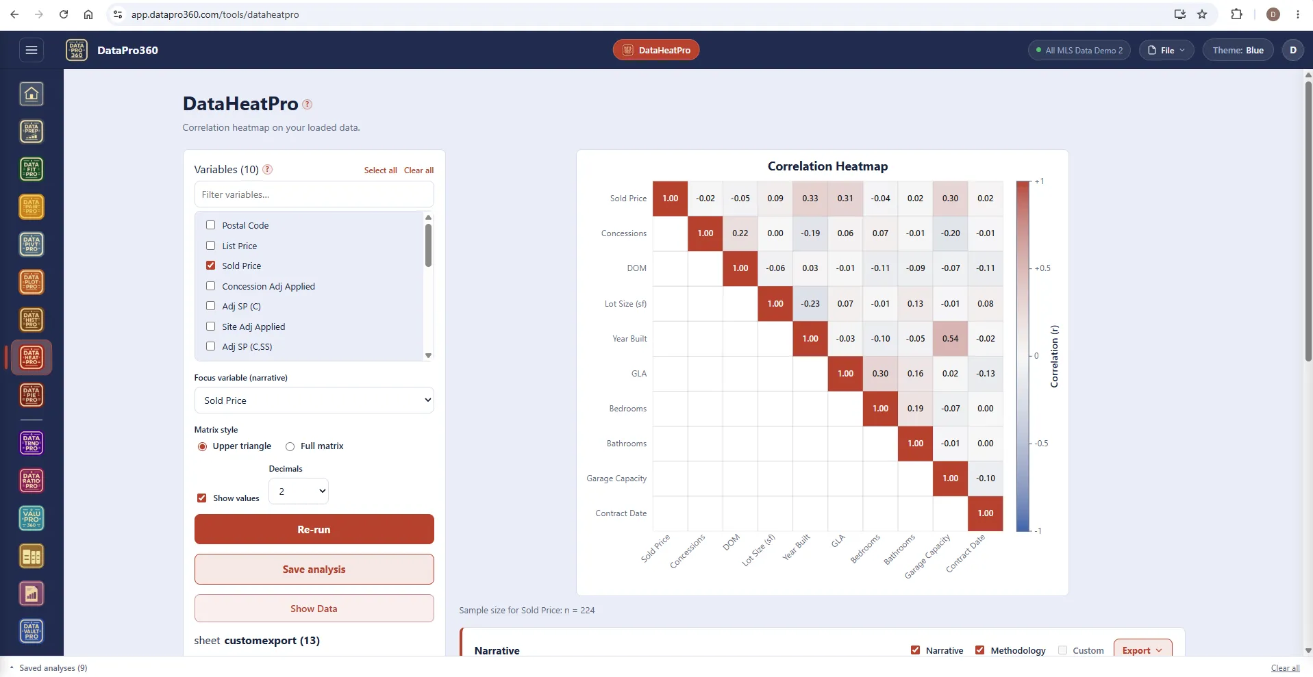
What it does
DataHeatPro draws a grid of correlations, colored by sign and strength. Pick the variables and every one is correlated against every other — each cell shows how strongly its row and column variables move together, computed over the rows where both carry a usable number. Positive and negative relationships take opposite colors, and the stronger the relationship, the deeper the color, so the structure of the data reads at a glance.
What you get: the matrix itself, with the correlation printed in each cell when you want the numbers and the color doing the reading when you do not; upper triangle or full matrix; a focus variable for the narrative; and the sample size behind it. The diagonal is always perfect — a variable against itself — which is why it reads as the frame, not a finding.
Two things to look for: the variables that move with price, and the variables that move with each other. A feature that travels with GLA — bathrooms, garage capacity, year built — is a feature whose contribution can be confused with size, and that is exactly the confounding the ValuPro360 layered order exists to remove. Correlation cannot see a curved relationship or a threshold; drill into a cell with Show Data before you conclude.
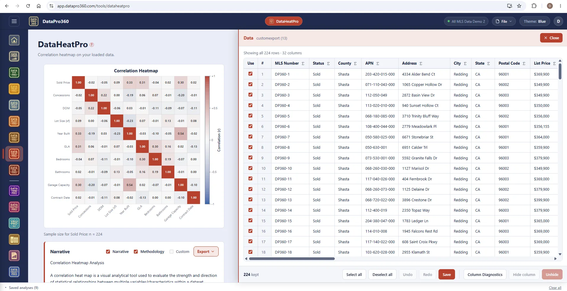
The full matrix, and the rows behind a cell.
Switch to the full matrix when the reader wants every pair. Click a cell and Show Data filters to the rows where both variables carry a number — the n behind that one correlation — and the narrative beneath the chart describes what the matrix found for the focus variable.
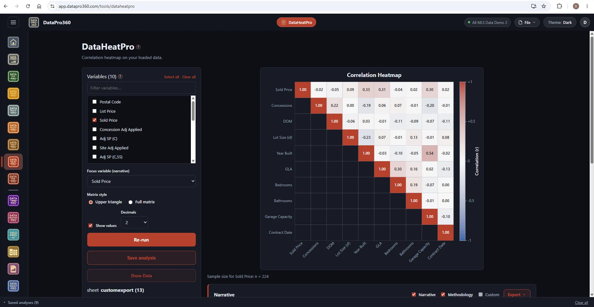
The same matrix in the Dark theme.
Sign and strength read the same on the dark workspace.
Where it sits
In the workflow
DataHeatPro reads the prepared dataset. Run it before the walk to see which features travel together; a saved matrix carries into Report Manager with its narrative.
See the whole workflow →Before
 DataPrep
After
 ValuPro360
 Report Manager
Prove the numbers in your next report.
Load your own MLS export and work a real assignment through the trial — every chart, every method, the finished report.
$69.95 per user, per month. 30-day free trial, no credit card required. No long-term contract.