
DataPairPro
Compare two groups on a numeric variable — and say how much they overlap.
Paired comparisons — isolate one variable from matched pairs of rows.
What it does
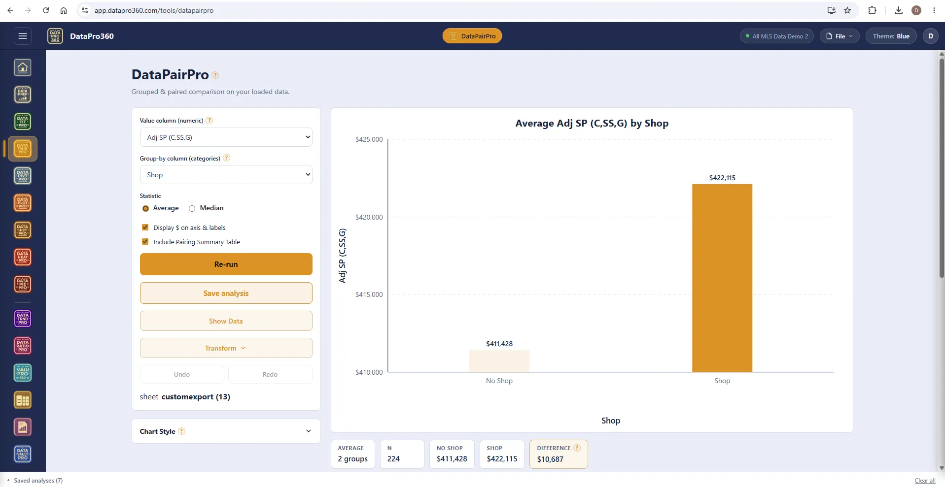
DataPairPro compares two groups against each other on a numeric variable. Split a dataset by a categorical column — shop or no shop, pool or no pool — and compare the resulting groups. Group A averages one figure, group B another: is that difference real, or is it the kind of gap two random samples produce?
The tool reports each group's statistics, the difference between them, and how much the two groups overlap. Overlap is the part that matters. Two groups can have clearly different means and still be, for practical purposes, the same population; reporting a difference as a finding without saying that the groups largely coincide overstates what the data supports. The difference alone will not tell you — the pairing summary table and the narrative do.
Run it on the raw sale price, or on the adjusted bases the ValuPro360 stations produce — Adj SP (C,SS,G) is the price with concessions, site and GLA already removed, so what remains between the groups is closer to the feature itself.
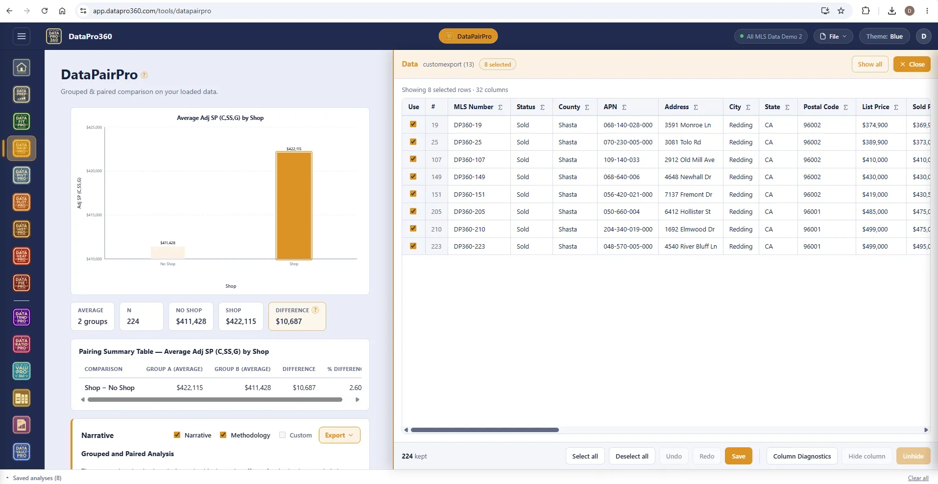
Show Data and the pairing summary.
The pairing summary table states each group's statistic, the difference and the percent difference. Click a bar and Show Data filters to the rows behind it; uncheck a row and the comparison recomputes with no apply button.
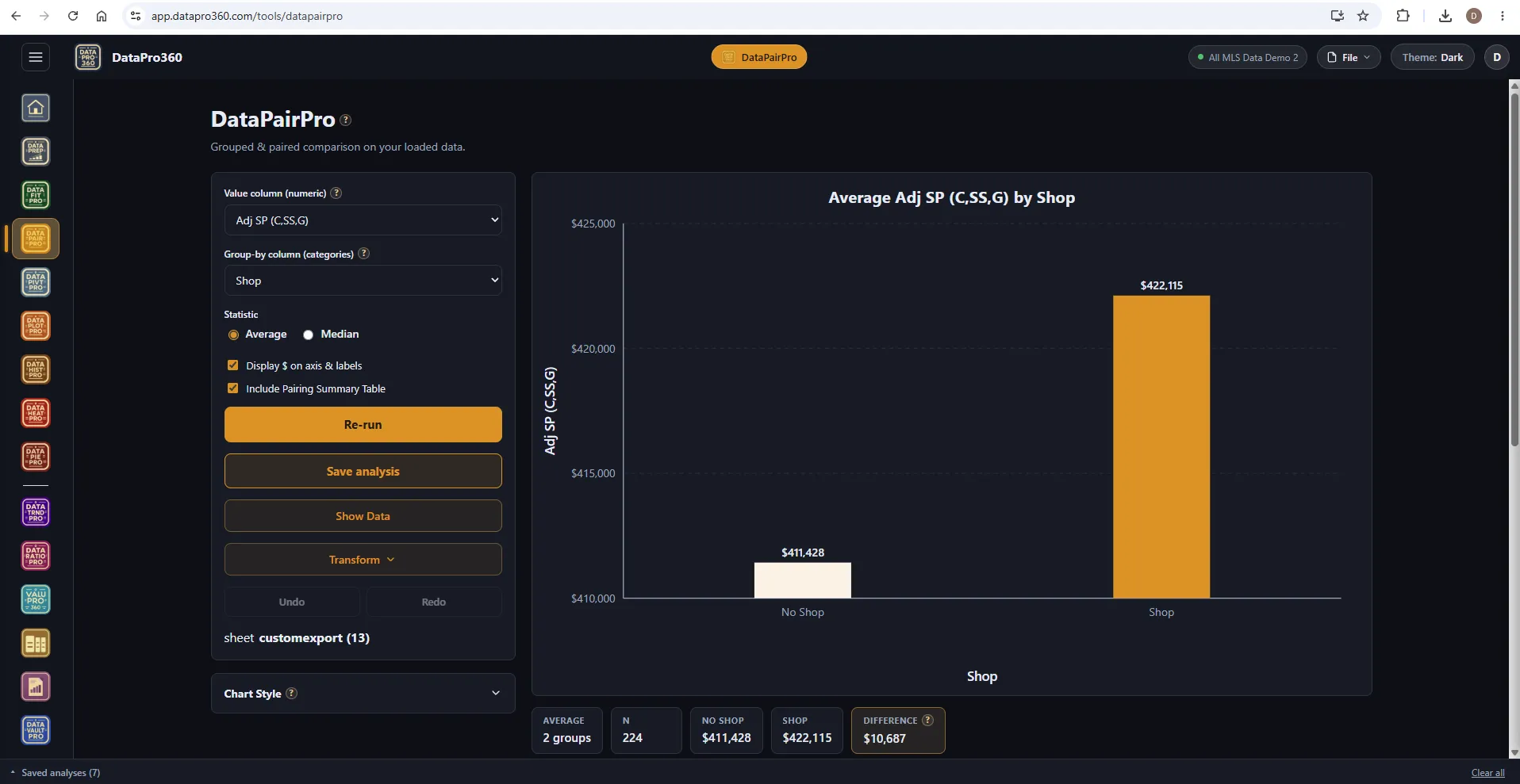
The same comparison in the Dark theme.
Average adjusted sale price by shop, no shop against shop, the difference on the strip.
Where it sits
In the workflow
DataPairPro reads the prepared dataset, including the adjusted bases the ValuPro360 stations write. A saved comparison carries into Report Manager with its chart, table and narrative.
See the whole workflow →Before
 DataPrep
 ValuPro360
After
 Report Manager
Prove the numbers in your next report.
Load your own MLS export and work a real assignment through the trial — every chart, every method, the finished report.
$69.95 per user, per month. 30-day free trial, no credit card required. No long-term contract.