
DataHistPro
Distributions — histograms of any field to see spread, outliers, and whether you have one market or two.
Distributions — histograms of any field to see spread and outliers.
What it does
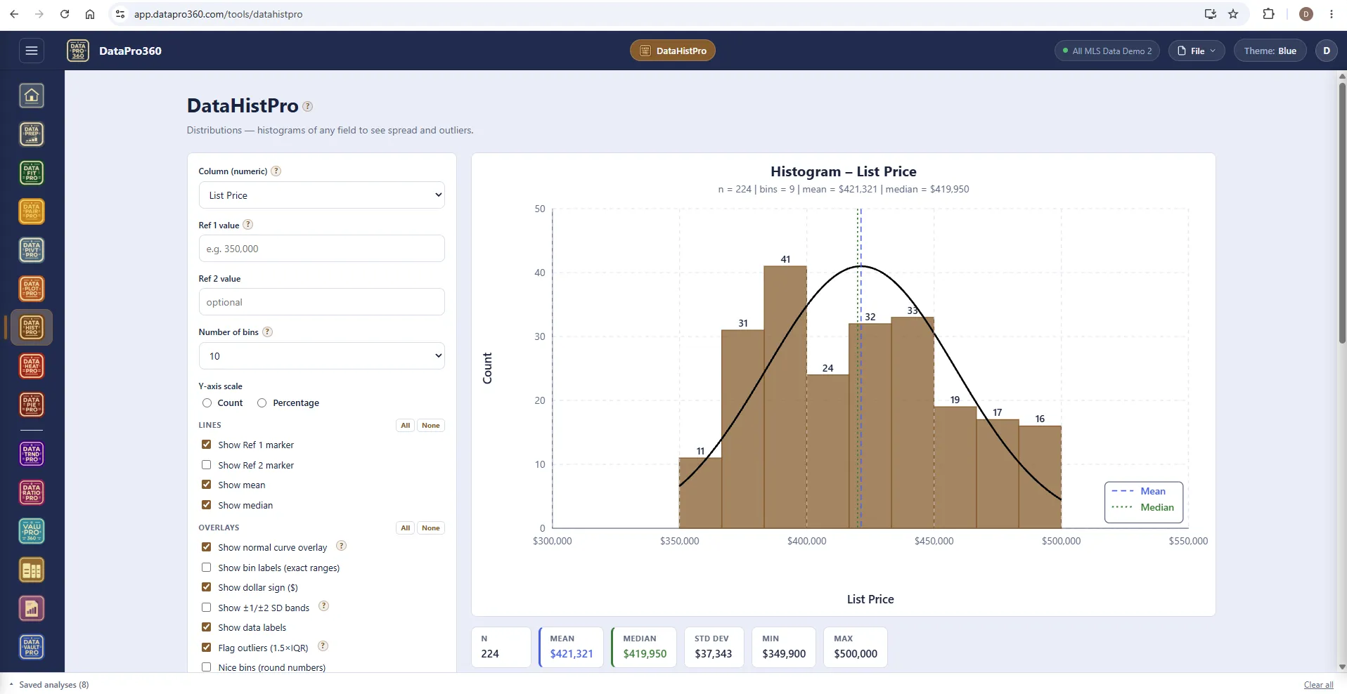
A histogram shows how a set of numbers is distributed: split the range into bins of equal width, count how many values land in each, and draw a bar for each bin. The shape tells you things a mean and a median cannot — whether the data is one population or two, whether it is symmetric or has a long tail, whether there are gaps where nothing occurs, whether a particular value is typical or unusual.
Choose a numeric column, press Run. Everything else on the surface refines what you are looking at — how many bins, which overlays are drawn (a normal curve, ±1/±2 SD bands, outliers flagged at 1.5×IQR), reference markers for values you care about, count or percentage on the axis, and which rows are included. The statistics strip reports the count, mean, median, standard deviation, minimum and maximum for whatever is currently included; the bin frequency table lists each bin's exact range and count.
Thirty seconds on sale price tells you whether you have one market or two, where the middle is, and whether anything is obviously wrong — which is why it is the second thing to open after the file loads. Every change is reflected in the narrative at the bottom, written from the current result, and it travels with the chart when you export.
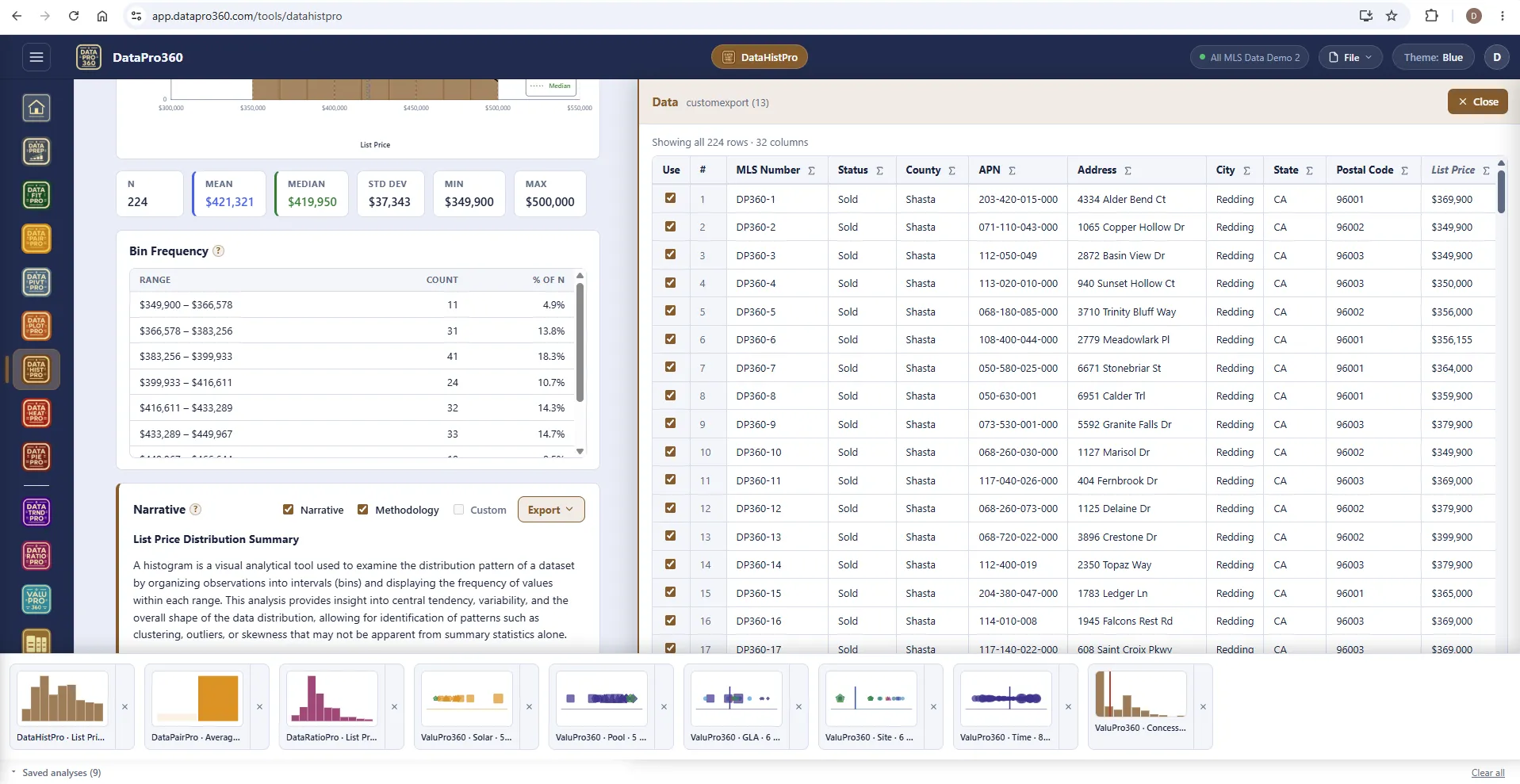
The bin table, the narrative, the tray.
Each bin's exact range, count and share of n. The narrative describes the distribution and the methodology, ready for the report; the tray along the bottom holds every saved analysis in the session.
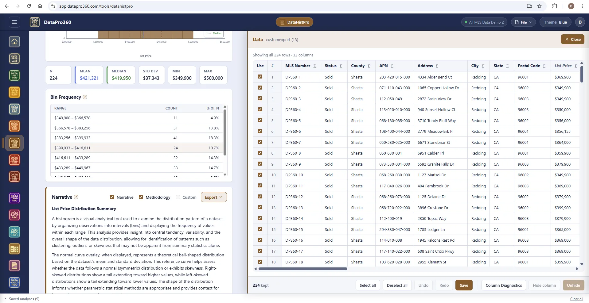
Show Data — the rows behind the bars.
Click a bar and the panel filters to the rows in that bin. Uncheck a row to exclude it from this histogram only; the chart, the strip and the narrative recompute at once.
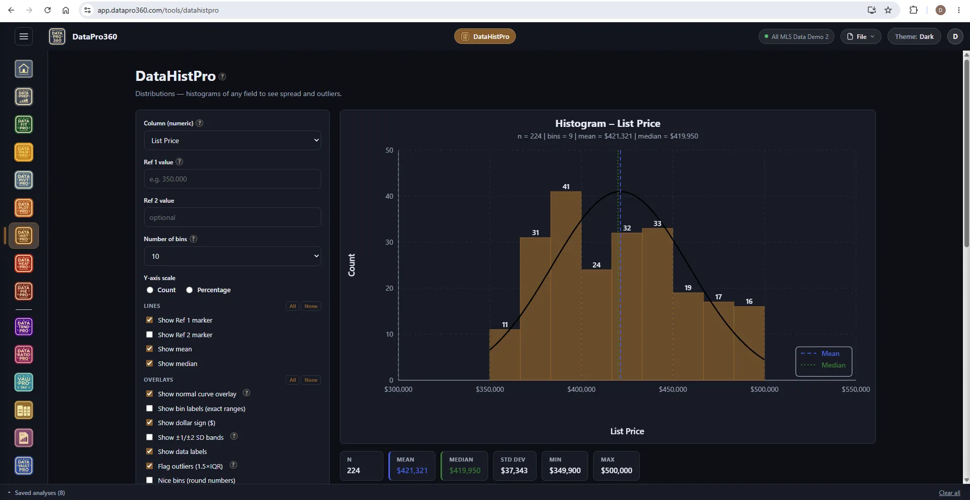
The same histogram in the Dark theme.
Bars, overlays, markers and the strip on the dark workspace.
Where it sits
In the workflow
DataHistPro reads the prepared dataset and can be opened directly on the Comp Grid's comparables as a histogram of the sales you are actually using. A saved histogram carries into Report Manager.
See the whole workflow →Before
 DataPrep
After
 Comp Grid
 Report Manager
Prove the numbers in your next report.
Load your own MLS export and work a real assignment through the trial — every chart, every method, the finished report.
$69.95 per user, per month. 30-day free trial, no credit card required. No long-term contract.