How do I document an adjustment so it holds up in review?
Douglas Kuss, Certified Residential Appraiser
You document it by stating, for every adjustment, the rate with its unit, the price basis it was measured on, how many methods ran and how many agreed, and the sample it came from — then putting the exhibits that show those things next to the narrative that states them. A reviewer is not asking you to be right. A reviewer is asking whether you can show the work.
What a reviewer is actually asking
Not "is $113 the true rate" — nobody knows the true rate, the reviewer included. The question is whether the rate was derived or asserted: can this figure be traced from the report back to identified sales through a stated method, and does the narrative's account match the exhibits' numbers? A rate with a stated derivation, a stated sample, and an honest band around it survives that conversation. A rate with a footnote does not.
The five things every supported adjustment states
- The rate — the figure the grid applies, stated where it was decided, including whether it is the calculated value or your override of it.
- The unit — dollars per square foot, per acre, per day, per month; a unit error is silent, so the unit rides with the rate everywhere it appears.
- The basis — the price the rate was measured on. "Derived on the concession-and-time-adjusted price" is one clause, and it is the difference between a layered rate and a confounded one.
- Method count and agreement — how many methods ran, how many landed inside the band, and where the band ran. Agreement between unlike methods is the evidence; the spread is the honest statement of certainty.
- The sample — how many sales, from where, over what period. Sixty sales support a different sentence than nine, and the reviewer should not have to count.
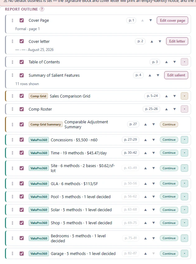
A report can carry all five in its structure rather than in scattered prose. Here is an outline doing it: one section per adjustment layer, each row already stating its decided figure and sample — concessions at $5,500 on sixty sales, time at $45.47 per day across 19 methods, site at $0.62 per square foot of lot across two bases, living area at $113 per square foot, and each amenity with its own decided level.
Showing the methods you excluded and why
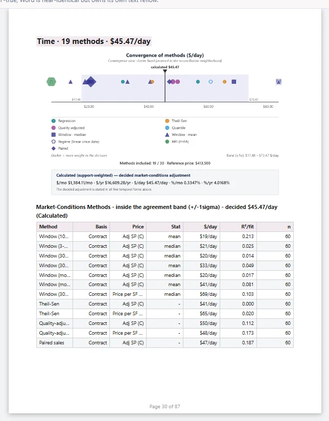
An adjustment section that shows only the methods that agreed looks curated, because it is. Show the whole table — included and excluded — and say why the exclusions were made: off-band, wrong shape for the data, a basis that double-counts a layer already removed. Here is a rendered time section doing exactly that: the convergence chart with its band running $17.48 to $73.47 per day, the decided rate stated in all five temporal forms, and a methods table headed by what it contains — the methods inside the agreement band, 19 of 30 included, each with its basis, price column, rate, fit and sample. The reviewer can see what was left out because the count says so on the page.
The narrative that says what you decided and why
The narrative has two parts, and they should not be confused. The measurement part is factual — how many sales, which methods, what each found, what was decided — and it is exactly the part worth generating from the analysis itself, because a narrative saying five methods when the table shows six is the kind of error a reviewer finds. The judgment part is yours and no generator attempts it: why you excluded a method, what verification established, what you know about the market that the data does not carry, why you concluded where you did. A report carrying only the generated description of the measurement is incomplete — it describes the analysis and not the appraisal.
Exhibits that match the narrative
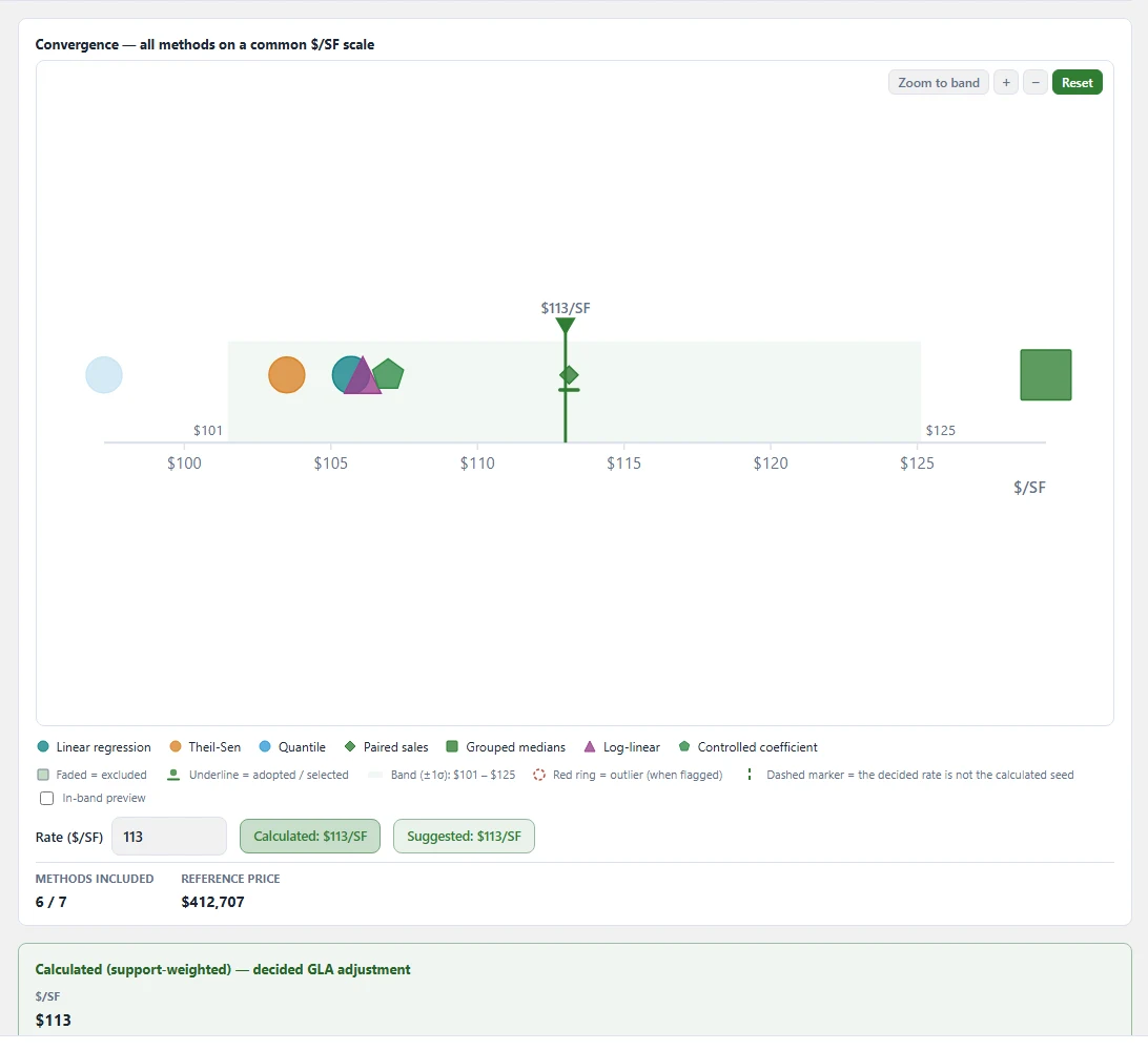
Every number the narrative states should be visible in an exhibit, and every exhibit should be the one the analysis actually produced — not a regenerated chart that renders differently than the one you decided from. Here is the GLA station's convergence chart as that exhibit: seven methods on one dollars-per-square-foot scale, the agreement band running $101 to $125, the calculated rate of $113 per square foot marked — the suggested rate reading the same $113 — with 6 of 7 methods included against a $412,707 reference price, any method sitting outside the band visible as exactly that, and the decided card beneath the chart stating the support-weighted $113. A narrative that says the living-area rate is $113, supported by a $101-to-$125 band, is quoting this exhibit. Narrative and exhibit cannot disagree, because they are the same numbers.
What a report looks like when it does this
Longer, and much harder to argue with. One section per adjustment in the order they were derived, each stating its five facts, showing its full methods table, and carrying the exhibits its narrative cites. The reader can start from any number in the grid and walk it backward — to the section that decided it, the methods that measured it, and the sales they measured it from. A thin level's count sits next to its value; a wide band is reported as a wide band. A reviewer who finds the weakness stated has nothing to find.
Doing this in DataPro360
The Report Manager assembles the saved analyses, the grid and the station sections into the finished Word or PDF report, with each layer's section carrying its decided figure, its methods table and the exhibits you toggled on. The measurement narrative is generated from the numbers it describes, and your judgment rides in custom notes — the division between what the program measured and what you concluded runs through the whole document.